Thursday, 17 December 2015

Movement - Work Diary

For my movement photoshoot, I decided to focus on using long exposures in order to capture lots of motion blur. To use these long exposures, I needed a very narrow aperture, so i stuck at f22 or narrower for the entirety of the shoot. This the depth of field was very wide in the images taken.

This is my favourite image from my movement photoshoot.


I like this partly because of the framing. I feel that the car in the image is positioned well; it looks like it fits with the rule of thirds composition rule, therefore, your attention is drawn towards it. The fact there are not any other cars apart from far off in the background also helps in drawing your attention to the car in the foreground. Additionally, I felt that there was the right amount of blurring on the moving car; I used an exposure of only a couple of seconds, so that the car would remain recognisable but will be blurred enough to create an effect of fast motion.

This is my least favourite photo from my movement.

While this does show motion, I feel that there is not a lot of interesting motion happening in this photo. I
also don't like how much the background has moved, which was due to camera shake. If I had used a shorter exposure, or put the camera on a tripod, there would be no camera shake, or at least a lot less. 
I also feel that the person who was waving the light could have tried to create a more recognisable shape, as that would draw the viewer to the image more than the shape that was drawn.

If I were to shoot movement again, I would bring a tripod when i'm going out to shoot, as that would have helped combat camera shake. I would also try and find more candid forms of motion, that were not directed to move for the picture e.g. people walking through the town, cycling and vehicles.


Movement - Straight Images


Movement - Contact Sheet


Wednesday, 16 December 2015

Depth - Work Diary

For Depth, I took photos on two separate days, on one day taking some photos in the studio as well as photos in public on both days. During these photoshoots, I focused on capturing narrow depth of field, and changing where the focus points were.

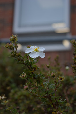
This photo is my favourite of the photos I took out in public.
I like this photo because it clearly presents depth through a narrow depth of field. This image also presents both saturated colours and muted colours, creating a contrast in colours as well as a contrast between dark and light tones. The contents of the photo present a contrast in moods, as the flower represents summer, whereas, in the background, there is a brick building that creates a contrasting mood to the flower. The focus point has been set well, as only the branch with the flower on it is in focus, and all of the bushes behind it are out of focus.

This is my least favourite of the photos I took out in public.

 
 Although this image shows depth through a narrow depth of field, there are other aspects of this photo that I don't like. I feel like it could be framed badly; some of the bench is not in the frame, and it is not quite in the center of the image. There is also a person in shot, who has half of his body out of the shot. Finally, I feel that the background was not very interesting, and should have been the part of the image that was out of focus, as I feel the wooden bench would have created an interesting texture if it was in focus.

Below is my favourite photo from my studio photos.

I like this because it displays a subtle but clear use of depth. While it doesn't create a dramatic narrow depth of field , you can see that the camera is sharply in focus, while his face is only slightly out of focus, therefore, attention is drawn to the camera. Also, with the focus point being at the front of the image, we are drawn to the first thing we see. I also like the way this photo has been framed; the subject is neatly placed into the middle of the frame.

This image is my least favourite from my studio depth shoot

I feel like the subject held the camera to closely to his face, therefore, both the camera in his face are in focus, and there is little depth shown. I feel that there is also a lack of other formal elements used in an interesting way, meaning the image just shows a very small amount of depth between the camera and the subject. This photo may have benefitted from being taken closer to the subject to further defocus the background, and being taken from a different viewpoint would have given it a difference from the rest of my studio depth photos.

If I were to shoot depth again, I would try and look at taking photos in a certain place, but changing where the focus point is and what is in focus, which is something I only touched on lightly. I would also bring in some props for the studio, and try and get some depth images in there from different viewpoints.


Thursday, 10 December 2015

Portraiture -

I am going to being going through the process of removing blemishes on somebody's face.
I opened my image, and the first thing I did was converted it to CMYK colour.
This is under the image tab.
Then, you go to channels and select the yellow channel.
 Once this has been done, we select all then copy it, or cmd+A, cmd+C
Now this is selected, we can go back to the layers, and make sure that the background is converted into a layer before pasting the yellow channel (cmd+V)
You should then have two layers; one with a normal colour, and the other with the yellow channel.


Wednesday, 9 December 2015

Portraiture - Lighting techniques

When you are taking portraits in the studio, you can change the way your photo is lighting. You can use either low key or high key light, with each creating different tones and a different mood in your piece. Here are some examples of Low key and high key lighting, respectively.


Low key lighting can create a sense of strength, due to lots of strong dark tones being presented. These tones can suggest masculinity and also suggest mystery, as a lot of the subject is obscured in darkness. If you use low key lighting in your photo, the photo will create an overall dark mood. 

However, High key lighting can create a sense of peace, due to emphasis of light tones. It can sometimes have connotations of femininity, as shown in the image above. High key lighting creates a sense of happiness, as he image is light in colour, and has few dark tones.

There are several pieces of equipment you can use to change the way the light works. 
One of these is a Snoot. 
A snoot is put on the end of a spotlight, and it makes the lighting beam smaller, so that you can light up a smaller area with your spotlight. This can be used for selective, low key lighting, e.g. lighting up one side of somebody's face. You can also use a honeycomb grid with a snoot.

Thursday, 3 December 2015

Joiners - Contact Sheets


Texture - Work Diary

For my texture photoshoot, I walked around my college and surrounding areas, and kept an eye out for rough or worn textures. I took some of natural rough textures, and others of man made objects that had been worn out over time.

This is my favourite photo from my texture shoot.
I like this photo because everything seen in the frame has an interesting texture. Also, the narrow depth of field means attention is drawn to the rock in the middle, which was my attention. There are a mixture of textures in the photo; there are smoothed out textures with some rough blemishes on the rocks, whereas the edge of the stone pot they are in shows a very rough texture, with clearly lots of bumps and
different stones poking out of it. I also like the fact there are lots of dark tones and muted colours.

This is my least favourite image from my texture shoot.

I didn't like this photo because I feel the texture was not very interesting to look at; it has some visible marks though is not clearly very rough or smooth. I also feel the background is distracting, as there is a large plant in it which draws your attention away from the texture which is in focus. I don't like the reflection it casts on the bin either, as it also draws attention away from the marks on top of the bin, which we are supposed to be looking at. Additionally, I don't feel that there are any other formal elements prominent in the photo to make it more interesting.

If I were to shoot texture again, I would attempt to take some texture photos in the studio, as I feel it would be interesting to try and capture some textures in controlled conditions and I feel that it would expand my knowledge and skill with the topic.

Texture - Straight Images


Joiners - Work Diary

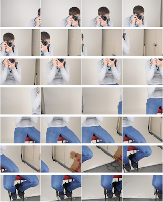
For my photo joiners, I did three photoshoots, as i planned to create three joiners. For each joiner, I went to a location I wanted to capture and took pictures of it while moving the camera across and then lowering it, then repeating until the camera was at a low viewpoint.

This is my favourite of the three joiners I made.
INSERT IMAGE
I like the fact a person was used in the image, as it creates an interesting form that you can manipulate to create a very broken up and distorted joiner image. I also liked the fact you could see past the studio background, as there are more things to the side of it that created interesting broken up forms. I feel that this added variation to my set of joiners, as it was the only one which involved people and was taken int he studio. I think this joiner benefited from me not using a tripod as I was able to physically able to move the camera and get different viewpoints.

This is my least favourite of the three joiners I made.

I didn't really like this photo joiner as much as the others. I think that the place i took it was not particularly interesting, as it didn't have a lot of complex structures that could be warped by the joiner. Also, I feel that i should have physically moved the camera to capture the images, as I used a tripod and simply turned where the camera faced, and I feel this resulted in a lack of different viewpoints.

If I were to create photo joiners again, I would try to experiment more with capturing people in my joiners, which I only did in one joiner. I would like to try incorporating props with the people in my pictures to try and create a few different visible pictures within the joiner.  

Texture - Contact Sheet


Pattern - Work Diary

For my pattern photoshoot, I went to an urban environment as I thought there might be lots of man made patterns there. I also found some natural patterns on the way to the town. Lots of my photos are images of patterns in floorings and walls.
This is my favourite image from my photoshoot.

This photo shows a man made pattern. I like it because the metal bars that the pattern is made up of also show texture as they are dirty and show some dark tones. I also like the narrow depth of field shown in the photo; the middle of the pattern is in focus but the rest is out of focus. The background behind the pattern is also out of focus, so attention is drawn to the pattern. Finally, there are a wide range of colours shown around the pattern, and some darker tones in the background.

This is my least favourite image from my photoshoot.

I don't think this shows pattern very well; it's too disorganised for my liking, as i prefer a pattern that shows symmetry and neat repetition like the one above. The image is also under exposed. Additionally,  
I feel that it doesn't show any other elements such as depth of field competently.

If I were to do this photoshoot again, I would try to focus on natural patterns, as in this photoshoot I focussed on man-made patterns.


Wednesday, 2 December 2015

Portraiture - Work Diary

For Portraiture, I did both a studio and public shoot. For my studio shoot, I got somebody to stand against the background and people to talk to her, while i took pictures of her expressions as she spoke. I also got somebody to do some set poses against the background. For my public shoot, I took some pictures of somebody else i took with me to do the shoot, and also used some people walking around the town.

This is my favourite image from my studio shoot.
I like it because it is quite close to the face so you can see the facial expression, but it also shows the shoulders so that you can see a bit more of the person in the photo. I like that a white background is used, as it means more attention is drawn to the subject of the photo. The black and white means the blacks are very dark and the light tones are very light, meaning it has a large tonal range. I also like the fact there is a shallow depth of field, as this means everything is in focus so we can see the details of the subject.

This is my least favourite image from my studio shoot.
I don't like this because the stool the person in the image's face is obscured by the stool they are holding up.  Also, i don't really like that the subject didn't quite fit on the background; you can see past the red screen that should be used as a background. Additionally, I feel that the image was not framed very well, as it has been taken not perfectly horizontally. Finally, I feel like prefer close up portraits than this full body style, as close ups show the subject's face in more detail.

This is my favourite image from my public photoshoot.
 I like this image because it has been taken with the subject leaning up against the wall, which is different to all the others. Also, the close up format means there is less background to be distracted with and attention is drawn to the subject. This image has quite a narrow depth of field, which means the background is not in focus, and therefore more attention is drawn to the subject.

This is my least favourite image from my public shoot.

I don't like the angle this is taken from as i feel it would have looked better if it was taken from at eye level of the subject. Also, it would benefit from having some background in shot so that a narrow depth of field could be achieved to drawn more attention to the subject. Finally, the image is not in focus, due to a mixture of the subject moving and camera shake. This could be prevented by using a tripod to take the photo.

In conclusion, if I were to do these photoshoots again, I would try to get more portraits from different distances, as mine were mostly close up portraits and I would like to explore full body portraits.

Tuesday, 1 December 2015

Definition - Printing

72 PPI - The general PPI for uploading images for viewing on the screen e.g. on websites.
300 PPI - The general PPI used for when you are going to print your image.

Friday, 27 November 2015

Portraiture - Image Bank

This is a portrait photo by Annie Leibovitz. The person in the photo is actress Jodie Foster. Whoever took this photo used an extreme close up and also vignetting, so that attention is drawn to the face, and other details are dark.


This is another portrait by Annie Leibovitz. The subject of the photo is actress Angelina Jolie. Unlike the Previous image, this appears to have not been taken in the studio. This means there is no vignetting or studio lighting. Also, this is image is taken more from a mid shot perspective rather than as a close up.


The image above is taken by Alec Soth. This is a very different type of portrait than the other two above, as it is taken far further away from the subject; you can see the man's whole body. Also, this image was not taken of a celebrity. This was taken somewhere in public, and the background is a lot less neat than in the other picture; there is lots of uneven floor and there are bits of broken wood in the background.

This Portrait is much less detailed than the previous ones. It has been taken in a studio on a white background, with no vignetting or selective lighting. It has a wide depth of field, therefore everything is on focus. It looks almost like it could be a passport photo, partly due to the blank expression of the man feature in the image. This photograph was taken by Thomas Ruff

Wednesday, 25 November 2015

Portraiture comparison essay

I am going to be comparing the works of Portrait Photographers Alec Soth and Thomas Ruff.
Here are some examples of Alec Soth and Thomas Ruff's work respectively


These works as typical of these photographers. They are both portraits, however, they are both taken from very different perspectives. Alec Soth often takes his portraits outside in a public place, usually with a very busy and interesting background. His portraits are taken of the entire body which is unusual for portraits as they are usually very close up. This viewpoint allows us to see more of the person, including their whole outfit and where they are standing. You can also take in what is around them too, which often contrasts to what they are wearing. For example, in the image above, the man is wearing a suit, however, his background contrasts as it shows broken pieces of wood and what appears to be a caravan. The floor he is standing appears to be very dusty and dirty, which also contrasts to his clothing. 

Thomas Ruff's portraits greatly contrast to the portraits of Alec Soth. Thomas Ruff's are always taken in a studio with a very plain background, unlike Alec Soth's which are taken in a public, and there is usually something to look at in the background. Thomas Ruff's portraits are also a lot closer to the subject, taken from the shoulders up. The background of Alec Soth's portraits is a plain colour, usually a white or grey studio background. Although there is less to see of the subject i these photos and also less to look at in the background, the close up viewpoint lets us see the subjects face in more detail. Unlike the Alec Soth's portrait, the expression of the subject is a lot more blank, much like a passport photo.

Tuesday, 24 November 2015

Portraiture - Straight Images


Portraiture - Definition

Portraiture is the art of creating portraits. A portrait is defined as an image of a person, usually taken of the head and shoulders. It is taken with a portrait orientation, hence the name portrait.
Portraits in Photography are usually made to express a certain emotion that the person in the photo is feeling at the time of taking the photo. They can be taken in s studio, so that you can control the conditions and get a very blank background, or they can be taken outside the studio, if you want some more interesting backgrounds and more natural lighting.