Showing posts with label connecting essay. Show all posts

Tuesday, 10 May 2016

Connecting Essay - Reflection


The image at the top is a reflection based photograph taken by me, and below it is a reflection based photograph by Marie-Claire Montanari. These photographs have both similarities and differences based upon their use of composition and the formal elements.

Based upon composition, I would say that these images are very different. For one, my image was taken using a landscape orientation and captures a wide angle, whereas Montanari's image was taken using a portrait angle, and captures a wide angle vertically. My image shows some symmetry in the reflection, as there are metal pillars which are reflected from one side of the glass to the other, however, the reflection shown in Montanari's image bears no symmetry at all, with view through the window being bookshelves and the outside image that is being reflected onto the window being a tall building. This creates a chaotic and disorganised mood in her photograph, whereas mine has connotations of calmness and order, due to my use of symmetry and straight lines.

These images also vary in the way they use other formal elements. The image by Montanari is in black and white so there is a very wide tonal range. There are some very light tones shown near to the bottom of the image in the books in the window and at the top on the building. It also displays some very dark tones in the middle of the image, which is created by the dark building being displayed in the reflection of the dark building behind the window.

My image, however. doesn't have a very wide range of tones. This is partly because I kept the image in colour rather than shooting in or converting to black and white. Also, the image was taken in a bright and well lit environment of a shopping centre, meaning there is not going to be a range of tones or areas of different brightness that could create a variation of tones.

Connecting Essay - Shape


This is a shot that incorporates the formal element of shape that was taken by me.
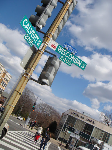
Below is a shape based shot that I have found on the internet. I am unsure who took this photo.


These pictures bare similarities in some ways.

For example, they have been shot in similar ways. They have bee taken at a canted angle, and roughly the same angle. They also both use signs to present shape. However, my image was taken using landscape orientation, whereas the other image was taken using portrait orientation. My image has also been taken from a very close up perspective, meaning there is very little background in the image. This is different to the other image I found, which was taken from a far less close up perspective, and has a foreground, mid ground and background.

Although they both feature shape, they each use it in different ways. My image only incorporates one shape in very close up detail. It shows a square with rounded edges, however, some of the corners of the shape have been cropped out, making it an irregular shape. On the other hand, the image I found online to compare to has several uses of shape. Although it uses a road sign to create a rectangular shape, similar to mine, the picture has some shapes featured in the background and mid ground too. There are more four sided shapes shown on the zebra crossing on the floor in the mid ground, and some more displayed as windows on the buildings in the background.

They also both make use of other formal elements. For example, both contain some saturated colours.
My image incorporates lots of blue, with saturated shades of blue on both the sign and in the sky. Overall, I would say the other picture contains much more bright and saturated colours than mine. For example, the sign shown in the image is a saturated shade of green, which is more saturated than the blue on the sign in my image. The blue sky in my image is a muted shade of blue too, whereas the blue of the sky in the other image is very bright and saturated.


Monday, 9 May 2016

Connecting Essay - Pattern

This is an image that uses the Formal element of pattern that I took.
This is an image by Alexander Jacques that also incorporates the formal element of pattern.

These images are very similar, as they both incorporate man made architecture to create a sense of pattern.

Both patterns I would say are very similar; both incorporate very sharp corners and straight lines, and they are both taken from a viewpoint that makes the pattern appear to be arranged diagonally. However, mine has been taken from a much closer perspective, meaning there is less pattern visible in the image. This means Jacques' image creates stronger connotations of repetition, schedule and order than mine does. Also, the pattern featured in Jacques' image is more organised and repetitive than mine, as the pattern I photographed gets smaller at parts, which can be seen in right side of my image, as the tiles start to shrink.

I would say there some differences in the way the pictures have been taken. For example, Jacques' image uses a very wide depth of field; everything in the picture is in focus, meaning he likely took the image using a very high aperture such as F22. On the other hand, my image has a narrow depth of field, as only a fairly small section near the front of the image is in focus. This occurred in my image because I shot it on an aperture of F4.8.

These images both incorporate formal elements other than pattern. For example, my image makes strong use of texture; the concrete used in the pattern has a very rough and bumpy texture, and there are some white blotches on it. However, Jacques' image features very smooth textures, which look so smooth they look like they have been created through a computer.

They also both incorporate colour; my image uses dark shades of grey that create connotations of sadness and depression. Jacques' image, however, is much brighter than mine. His image mostly contains shades of orange, which is a colour that represents joy and sunshine. On the other hand, shade of orange used is very dull and muted, suggesting a hint of sadness.

Thursday, 4 February 2016

Connecting essay - Form

This is my form image.

This is an image that incorporates form that was taken by Julian Velez.

These images are very similar, as they both use a metal chain to create form.

The image by Julian Velez has been converted to black and white, which captures a depressing mood, due to the lack of tone or colour variation. However, I have kept my image in colour, which means the mood it creates is far less depressing.

My image makes good use of texture. There are some very rough textures in my image, which are shown on the chain. There are very degrees of detail in my textures, the ones at front being more detailed due to being in focus. The Julian Velez image also makes use of rough texture on the chain, however, the chain in his image is more worn than the one in mine, therefore it incorporates much rougher, more weathered textures than mine does. This image also incorporates other textures other than the one on the chain, as wood is visible behind the chain. The wood also appears to be a rough texture, however, it has lines in the texture that give it a smoother quality, as if you could run your hand along the lines.

My image I feel also makes better use of tone than the Julian Velez one. Since I kept my image in colour, you can see a large tonal range. There are some very dark highlights on the links of the chain, with some lighter tones around the edges of the links from the light shining on the metal. There are also some very light tones shown in the background behind the chain, which create a tonal contrast between the background and the foreground. I feel that the image by Julian Velez does show some tonal contrast, with some lighter tones shown in the background and some darker tones in the shadows created by the chain, however the conversion to greyscale I feel took away some of the tones that would have been visible if the image would have been in colour.

Also due to the removal of colour in Julian Velez' image, I feel mine better shows this formal element. In my image, there are lots of muted colours that help connote the depression and imprisonment that a chain presents. There are lots of muted highlights of blue shown on the chain, which are muted because they are mixed with the shades of black.

I also feel my image was composed better than the image by Julian Velez. I used f/5.6 to achieve a narrow depth of field, so that only a very small area of the chain in the foreground is in focus. I also prefer the close up perspective to the mid shot perspective that Julian Velez has used, as I feel it lets you see much more detail in the textures of the chain, and means less background is visible to distract you from what's in focus.

Thursday, 28 January 2016

Connecting Essay - Colour

This is a photograph by Jim Turner which heavily features the formal element of colour.
This image makes use of lots of saturated shades of yellow.
This is one of my straight images for colour. Like the image by Jim Turner pictured above, there has been use of lots of saturated colours. However, my image has a range of colours, including different shades of saturated colours and some muted colours, whereas the Jim Turner image only uses yellow, green and blue.

Like the Jim Turner image, my image makes use of the rule of thirds composition rule. As you see, both have placed the subject along the vertical line to the right, with the subject and the background meeting at the top right point.

They also both use a narrow depth of field. Jim Turner's image keeps the flower closest to the lens in focus, the two behind it semi in focus, and the rest of the flowers in the background behind them are out of focus. In my image, the bicycle tyres are all in focus except for the one closest to the camera, and everything behind the tyres in the background is out of focus. 

The image by Jim Turner uses a large amount of very light tones to create a very tonally rich image, however it lacks when it comes to a wide tonal range. My image uses some very light tones, however, it also uses some darker tones, particularly on the floor and in the background, therefore my image has a wider tonal range than the one by Jim Turner. 

They also both make use of textures. My image contains some very smooth, slick textures, which are shown on the bicycle tyres and in some of the bicycle frames in the background. It also makes use of some rough, bumpy textures on the floor, therefore, there is a contrast in textures in my image. Jim Turner's image also uses a contrast in tones. It uses some smooth textures, which are shown in the petals of the flowers and it also shows some very bumpy textures in the centre of the flower.